Respecting user preferences for color scheme and contrast
I had a lot of fun building this new site and catching up on learning some CSS media queries. Here's how I used CSS custom properties and a basic system to support both a dark-mode and a high-contrast mode for my new site.
The joy of a new site
I’ve been craving to do some design work, and I was sick of paying what was $168 a year for my squarespace site at the time, so I decided to design and build my website from scratch – without using AI, which is crazy that I even want to mention this. I learnt a couple cool things in process that I’ll share in a few posts, so here’s how the colour system works…
Colour system
I knew I wanted the site to be as accessible as possible, so in Sketch I defined a foreground and background colour styles and implemented them in code as custom CSS properties in order to swap these out in order to support dark-mode. These have a miniscule amount of saturation of a yellowy-orange hue in order to warm up the gray a little:
:root {
  /* bg = background */
  --color-bg: hsl(38 4% 95%);
  /* fg = foreground */
  --color-fg: hsl(38 4% 13%);
}

html,
body {
  background-color: var(--color-bg);
  color: var(--color-fg);
}
I’ve referenced these custom properies here directly because I’m not collaborating on the design with anyone else. If I were working with someone else, I’d want these to be more expressive.
To do this you can define more semantic variables which encapsulate the context in which they are used, called “choice” tokens, something like --color-text: var(--color-fg) and --color-background: var(--color-bg). Read more about the difference between option and choice tokens in this fantastic article by Nathan Curtis.
Instead of displaying a button to toggle to color scheme, I decided to listen to the user’s preferences given by their operating system using the prefers-color-scheme media query:
@media (prefers-color-scheme: dark) {
  :root {
    --color-bg: hsl(38 4% 13%);
    --color-fg: hsl(38 4% 95%);
  }
}
You can test this in your browser’s developer tools, here’s how to do it in Safari and Chrome. Note that in Chrome you need to navigate to the Rendering settings in Settings -> More Tools -> Rendering.
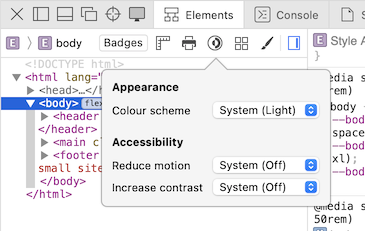
Emulate different prefers-color-scheme and prefers-contrast settings in Safari developer tools
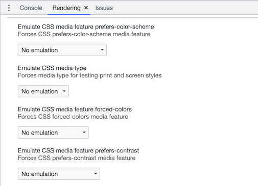
Emulate different prefers-color-scheme and prefers-contrast settings in Chrome developer tools
As I designed the rest of the site I found the need for foreground colours of varying contrast with the background for things like the date, icons, and other strokes like borders and the decorative lines behind my profile in the footer. I also defined another two background colours, one specifically for the custom 404 and 500 error pages which have a slight redish-pink hue, and one that is even more contrasty with the foreground, and I use it to create a sense of depth in code blocks and as the background for the photo album gallery for the photo posts.
Here’s the complete list:
/* Color tokens */
:root {
  /* The normal background color for good contrast*/
  --color-bg: hsl(38 4% 95%);
  /* A background color for the 400 and 500 pages with a slight red tint */
  --color-bg-error: hsl(360 40% 95%);
  /* A background color that's 'darker' that the normal background, used as 'surface'/'fill' colour to create depth */
  --color-bg-negative: hsl(0 0% 100%);
  /* The normal foreground color for good contrast against the normal background */
  --color-fg: hsl(38 4% 13%);
  /* A foreground color that's less contrasty but still AA so can be used for text */
  --color-fg-medium: hsl(38 4% 40%);
  /* A foreground color that's even weaker contrast and intentionally fails accessible contrast levels so shouldn't be used on text or thin strokes */
  --color-fg-weak: hsl(360 1% 60%);
  /* A foreground color that's very weak contrast, used for subtlety */
  --color-fg-weaker: hsl(38 4% 83%);
}

@media (prefers-color-scheme: dark) {
  /* As above... */
  :root {
    --color-bg: hsl(38 4% 13%);
    --color-bg-error: hsl(360 40% 13%);
    --color-bg-negative: hsl(0 0% 0%);
    --color-fg: hsl(38 4% 95%);
    --color-fg-medium: hsl(38 4% 49%);
    --color-fg-weak: hsl(38 4% 40%);
    --color-fg-weaker: hsl(38 4% 30%);
  }
}
Furthermore, while transferring some posts from the old site which only had a light mode I had a few PNG images that had dark text on a transparent background, this didn’t look too good in dark-mode so I created a utility to invert the image colours – luckily they were simple black and white images so this worked well, if they had colour it probably would have just looked weird.
@media (prefers-color-scheme: dark) {
  .invert-image-dark-mode {
    filter: invert(1);
  }
}
Image before inverting colours with .invert-image-dark-mode
Image after inverting colours with .invert-image-dark-mode
High contrast mode
I was reminded of my mom who uses her iPhone with a larger text size and it got me thinking if I could make a few small CSS changes using the prefers-contrast media query to make the site more readable for people that need it.
Windows has had a high contrast mode for a long time but to my understanding it uses the forced-colors media query to swap colours in the UI for a specific set to achieve an extremely high contrast. I also learnt you can actually configure these colours as a user, and might end up with a UI that actually has less contrast in this case. You might have encountered this mode by having to set a transparent border on your borderless buttons for them to have a visible border when this mode is on.
Is the use of forced-colors to achieve super high contrast actually a hack? I’m not sure.

GitHub signup page rendered with Windows High Contrast Mode on
Since I had somewhat of a colour system in place, I needed 2 more sets of colour: one for light-mode with increased contrast, and another set for dark-mode with increased contrast.
@media (prefers-contrast: more) {
  :root {
    --color-bg: hsl(38 4% 99%);
    --color-bg-error: hsl(360 40% 99%);
    --color-bg-negative: hsl(0 0% 100%);
    --color-fg: hsl(38 4% 3%);
    --color-fg-medium: hsl(38 4% 20%);
    --color-fg-weak: hsl(38 4% 40%);
    --color-fg-weaker: hsl(38 4% 50%);
  }
}

@media (prefers-color-scheme: dark) and (prefers-contrast: more) {
  :root {
    --color-bg: hsl(38 4% 3%);
    --color-bg-error: hsl(360 40% 9%);
    --color-bg-negative: hsl(0 0% 0%);
    --color-fg: hsl(38 4% 99%);
    --color-fg-medium: hsl(38 4% 95%);
    --color-fg-weak: hsl(38 4% 90%);
    --color-fg-weaker: hsl(38 4% 85%);
  }
}
I also realised I could increase the font-weight of the text slightly to improve the contrast. My designer friends would be happy that I recognise contrast is not only about the difference in colour 😄.
@media (prefers-contrast: more) {
  :root {
    --font-weight--title: 500;
    --font-weight--heading1: 500;
    --font-weight--subHeading: 500;
    --font-weight--body: 500;
  }
}
Conclusion
Using CSS media queries and custom properties, you can easily create a system that supports a dark mode and a high-contrast mode, both of which can be activated automatically based on the user’s operating system preferences.
By paying attention to the details and incorporating feedback, we can continue to improve the accessibility of our websites and make them more inclusive for everyone.
I’m sure my site requires a lot more by way of accessibility. Do you have a suggestion on how it can be improved? I’d love to hear from you.
Questions? I’d be humbled and happy to help.